How Mobile-First Brands Can Keep Colors Consistent From Social Posts to Print
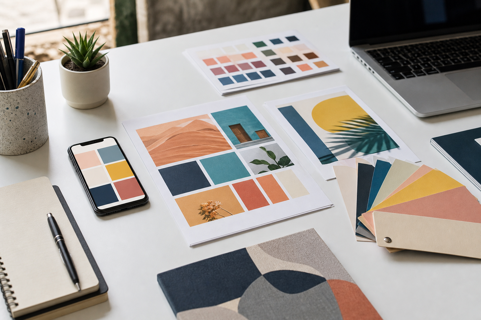
A brand color can look perfect in a mobile app, slightly different in an Instagram story, and surprisingly dull on a printed flyer. For mobile-first brands, that gap matters. Customers often meet a company through a phone screen, but they still encounter the same brand on business cards, packaging inserts, pop-up banners, postcards, menus, and event materials. When those touchpoints feel visually disconnected, the brand starts to look less deliberate.
Color consistency is not about making every medium identical. Screens emit light, paper reflects it, and each platform compresses or interprets color in its own way. The real goal is to build a workflow that protects the intent of the color: the same energy, contrast, and recognition wherever people see it.
Start With a Screen-First Source of Truth
Most small teams now design brand assets around mobile use first. That makes sense: app icons, profile images, stories, ads, screenshots, and landing pages often go live long before anything is printed. But if your only source of truth is a screenshot or a social media template, print production becomes guesswork.
Create a simple brand color reference that includes the exact values used in digital assets. At minimum, document the primary color, secondary color, neutral colors, and any accent colors used for buttons, badges, alerts, and promotional graphics. Store the values somewhere your designer, marketer, and printer can all access.
| Color system | Best use | What to watch |
| RGB / HEX | Apps, websites, social media images, email, digital ads | Bright screen colors may not translate directly to paper |
| CMYK | Flyers, brochures, packaging inserts, posters | Some vivid RGB colors become flatter when printed |
| Pantone | Brand-critical print jobs, packaging, signage, merchandise | More precise but usually more expensive |
Translate Color Before the Deadline
The worst time to think about print color is the night before a campaign goes live. If your brand relies on strong visual identity, convert and compare colors early. Tools like Hue.ink can help teams move between color formats and make smarter handoff decisions before files reach a printer.
This step is especially useful for mobile-first brands that create assets in Canva, Figma, Adobe Express, or social media design apps. A color that feels crisp on an OLED phone screen might need adjustment for a matte postcard or a recycled paper flyer. Early conversion gives you time to choose the closest practical match instead of accepting whatever the print process produces.

Build a Cross-Channel Color Checklist
- Keep master brand colors in RGB, HEX, and print-ready equivalents.
- Test key colors on both bright and dark mobile screens before approving social templates.
- Ask printers whether they need CMYK values, Pantone references, or both.
- Order a small proof for important printed materials instead of relying only on a PDF preview.
- Save final approved colors in a shared brand folder so future campaigns start from the same reference.
Pay Attention to Backgrounds and Contrast
Brand color problems are not always caused by the main color itself. Backgrounds, shadows, gradients, and image overlays can change how a color feels. A button color that reads clearly on a white app screen may lose contrast when placed over a busy photo in a story template. A pale accent that looks elegant online may disappear on an uncoated business card.
Before approving a campaign, test color combinations in the actual context where they will appear. Look at app screenshots on a phone, view social graphics inside the platform, and print a small sample of any physical asset. A practical review beats a theoretical color chart every time.
Create Rules for Campaign Variations
Mobile-first marketing moves fast. Teams often make variations for Instagram posts, app banners, email headers, paid ads, and print leave-behinds. Without rules, every variation becomes a chance for color drift.
Useful Rules to Document
- Which color is used for primary calls to action.
- Which background colors are approved for dark-mode or high-contrast layouts.
- Which colors should never be used for small text.
- Which print materials require a proof before production.
Make Color a Workflow, Not a Last-Minute Fix
Consistent color is one of those details customers may not consciously notice, but they feel it. It makes a brand look stable, thoughtful, and easier to remember. For app-led companies, creators, and small businesses, the strongest approach is simple: define digital colors clearly, translate them for print early, test them in context, and keep approved values easy to reuse.
When color is treated as part of the workflow rather than a final polish step, every touchpoint starts to feel like it belongs to the same brand.